/
Interface Changes
Interface Changes
There are applied changes to the user interface when viewing individual test cases within the test repository page. There are changes in the UI to to improve the amount of real estate is available when viewing an individual test case. There are also changes to improve the way users can navigate through multiple requirements, test cases, and test executions. These changes are also useful to help move quickly from one to another.
Anchors
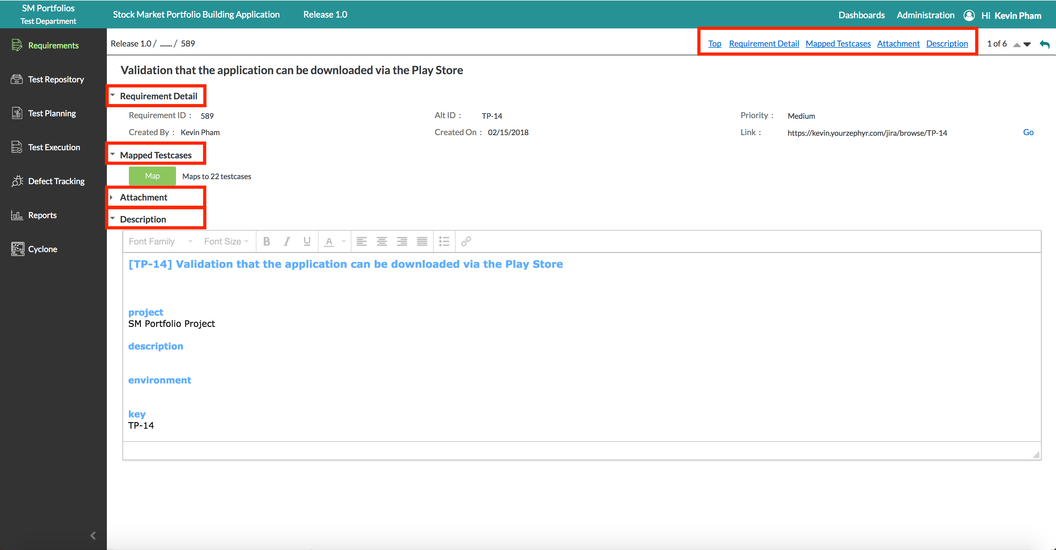
- There are anchors located at the top of the interface that helps the user to navigate to specific sections of the page.
Fullscreen Interface
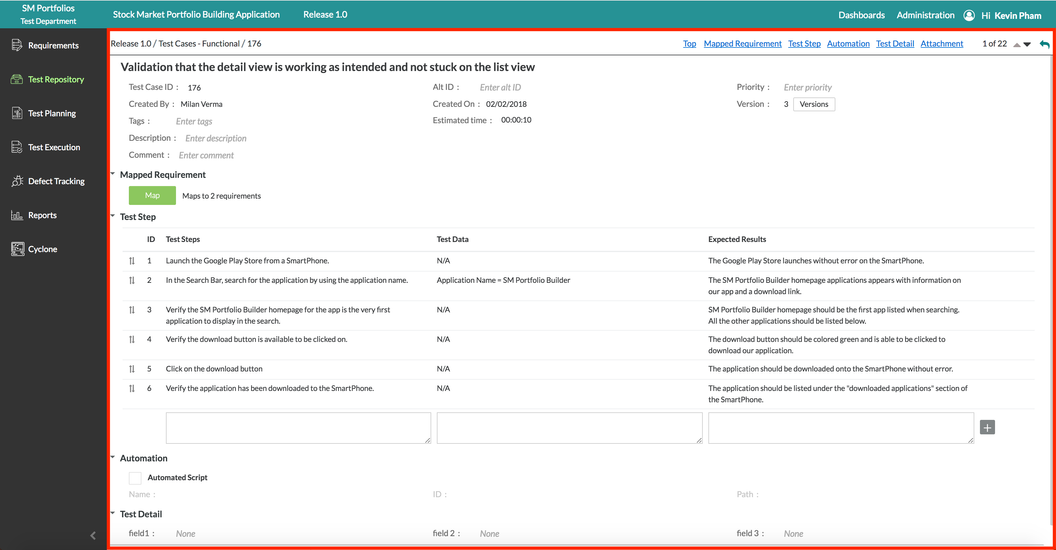
- Viewing individual test case takes up the whole interface
- When viewing an individual requirement, test case, or test execution, it's not displayed at the bottom like in 6.0. It expands to take up a large portion of the interface.
Additional Note
The "fullscreen interface" is a change that applies when viewing individual requirements in the requirements page, test cases in the test repository page, and the individual test cases/executions under the test execution page. These changes are made to ensure that users have the most amount of room to work with.
Additional Navigation
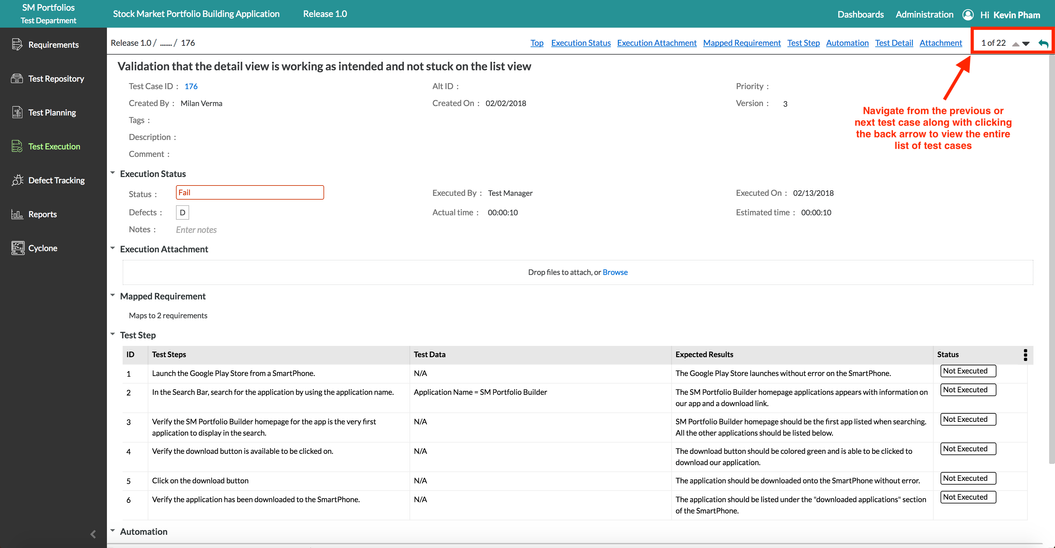
- The user can simply click the up and down arrows in the top right of the interface to move back and forward on the list when viewing individual test cases.
- The user can also select the back arrow in the top right of the interface to stop viewing a test case individually and it allows you to go back to viewing all the test cases in the folder(s).
Related content
6.1 Release Notes
6.1 Release Notes
More like this
What's New in Zephyr Enterprise
What's New in Zephyr Enterprise
More like this
6.2 Release Notes
6.2 Release Notes
More like this
Writing Testcases
Writing Testcases
More like this
Tester Desktop
Tester Desktop
More like this
Lead Desktop
Lead Desktop
More like this


